There is a reason behind some videos achieving high view count, and videos with excellent content are unable to get much viewership – thumbnail. A thumbnail functions as a main factor that determines viewer behaviour and plays a critical role in youtube views increase. People first come across a thumbnail when they search through YouTube, which determines their decision to either watch your content or move on to other videos.
Creators need to learn how to make thumbnail for YouTube, as it will help attract viewers amidst an ocean of videos attempting to attract views.
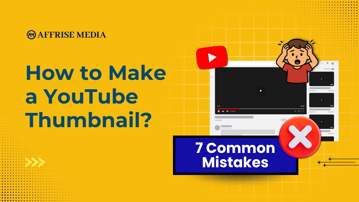
In this blog, learn about 7 common mistakes which most creators make when it comes to making thumbnails for YouTube. The ability to create good thumbnails will enable you to grow your audience base, which will benefit your video content regardless of the content type which you produce, including vlogs, tutorials and reviews.
What is YouTube Thumbnail?
A YouTube thumbnail serves as the initial image that viewers see, which helps them decide to watch a video. The visual element your audience sees provides a concise overview of your complete content. A viewer will either select your video or continue watching other content based on the combination of your title and well-designed thumbnail. Top creators use thumbnails as a fundamental element of their strategy because they understand how important this aspect of work is to their success.
Well-designed thumbnails create an immediate visual impact, which enables viewers to understand your content within moments of their first view, even on mobile displays.
Also Check: Performance Marketing Agency in India
Mistake #1: Trying to Say Too Much
One of the biggest mistakes creators make when learning how to make thumbnail for YouTube is adding way too much text or too many visual elements to it. YouTube thumbnails appear in small sizes, especially on mobile screens, and so, cluttered or texty thumbnails fail to communicate the message quickly.
Why This Happens
Many beginners, while understanding how to make thumbnail for YouTube,think that more text equals more information, but in reality, the viewers don’t read that much. The detailed visuals create a chaotic and confusing display, losing the core message.
What to Do Instead
It is important to use simple language when understanding how to make a thumbnail, as the content requires a better understanding through direct emotional impact. A combination of short, powerful lines describing your video content builds interest in the viewers.
Experts recommend that you limit the thumbnail text to a maximum of 3-5 words, as it gives the best results. For example, the title “Learn How to Get More Views on YouTube in 2025 quickly” can be written as “Get More Views on YouTube!” Herein, the latter provides the information in a bold format in a few words for the viewers to quickly understand.
Mistake #2: Using Small or Hard-to-Read Text
When creators learn how to make thumbnail for YouTube, things may go wrong if they:
- Use think fonts
- Use long sentences
- Fail to test the look of thumbnails when shrunk
Why This Matters
Most viewers watch YouTube on their mobiles. Your thumbnail design fails to attract most viewers because the text on it becomes unreadable on a small display. Brands often pick bold fonts specifically because they remain visible even when small.
Smart Fix
Use bold, high-contrast fonts like “Montserrat” in designing the thumbnail. The text needs to stay small while maintaining complete clarity in YouTube’s preview size. Check if you can read well on the thumbnail when shrunk.
Mistake #3: Ignoring the Emotional Hook
Attractive thumbnails without emotional content create an appearance which people find difficult to remember. The main element which creates clickable thumbnails needs to establish a strong emotional bond with viewers.
Why Emotion Matters
Humans have natural reactions triggered by facial expressions. A facial expression creates an immediate connection between viewers and your narrative because it shows excitement, shock, joy, or curiosity. It is recommended that creators put a photo of themselves with facial expressions which show strong emotions.
How to Improve
- Show facial expressions through close-up shots
- Show people experiencing surprise, joy, and suspense
- Neutral expressions should be avoided
Mistake #4: Poor Colour Contrast and Bland Design
Another common pitfall in making good thumbnails for YouTube is using low-contrast colours or dull visuals that blend into YouTube’s background.
Why This Affects Views
You need to create visually attractive thumbnails because YouTube presents multiple thumbnails which display your content. The text becomes invisible because of the combination of low contrast with plain colours, which creates background effects, making the thumbnail text almost unreadable. People read better when they see high contrast text, as it attracts their attention and is easy to read on different devices.
Expert Tips for Better Design
- Use bold, contrasting colours between text and background
- Choose colours which create high visibility
- Restrict your colour choices to three main colours that you will use throughout the design
The use of strong contrast improves your design’s visibility, which makes your thumbnail more appealing to viewers.
Mistake #5: Clickbait That Doesn’t Deliver
The worst mistake people make when learning how to make thumbnail for YouTube is their choice to use eye-catching images and false statements, which attract initial viewer interest.
Why Clickbait Backfires
While trying how to make thumbnail for video, a person might click on a deceptive thumbnail, which brings them to the content, but they exit the video when it fails to deliver what they expected. YouTube’s algorithm prioritises watch time and viewer satisfaction, and not just clicks. The use of deceptive thumbnails results in negative effects instead of providing benefits.
How to Improve
Understand how to make a thumbnail. The thumbnail needs to display your content in the best way that matches your actual video content. The combination of an eye-catching visual element with precise content details creates a trustworthy thumbnail which helps achieve optimal results.
Mistake #6: Thumbnail not Aligned with the Title
This is a less talked-about issue, but a critical one in how to make a thumbnail for YouTube. The combination of the thumbnail and title needs to create a narrative that attracts viewers.
What Usually Goes Wrong
Creators often do this – they put thumbnail content as “10 Tips!”, while they can enhance it by writing “10 Tips to Grow Faster in 2026”. The result? They waste valuable visual space and are unable to capture people’s curiosity. When learning how to make a thumbnail, you need your content to deliver different messages, which should not repeat each other.
How to Fix It
The title needs to explain the video content, while the thumbnail should show the reason why viewers should watch the video. This combination increases both curiosity and clarity, and boosts click-through performance.
Also Check: : People also search for
Mistake #7: Creating the Same Thumbnail Style Forever
The last common mistake when learning how to make thumbnail for YouTube is using the same style for every video.
Why This Hurts Growth
Repetition breeds familiarity, but too much of the same style can make your thumbnails boring and, ultimately, invisible in feeds. Viewers quickly learn to ignore content that looks “just like the rest.”
What to Do Instead
Keep brand consistency (fonts, colours) but vary layouts, facial expressions, and composition. A fresh look signals something new and may re-ignite interest in viewers, even among existing subscribers.
Pro Tips
- Attractive Thumbnail
Most viewers browse YouTube on their mobiles. All thumbnails must be designed to work better on mobiles. One should create their thumbnail designs based on small screen requirements, and test them by viewing it at a reduced size.
- Aim for Clear Focal Points
The audience needs to see one main subject or message, as multiple elements may create confusion.
- Consistency Builds Recognition
Being consistent with your thumbnail’s template, style, font, and appearance helps people spot your content, ultimately helping your videos attract more views.
- Thumbnail & Title A/B Testing
YouTube lets creators test up to three thumbnail and title combinations on a single video, then automatically applies the best-performing option, helping creators optimize results using real data instead of guesswork.
Conclusion
Understanding how to make thumbnail for YouTube isn’t just about tools or software, it is also about psychology, clarity, and strategic storytelling. When you avoid the common mistakes mentioned above and adopt proven techniques from top creators, you’ll see notable improvements in your video engagement and channel growth.
When learning how to make video thumbnails for YouTube,remember, your video thumbnail is a mini billboard to the world. Make it count.
Also Check : Performance marketing agencies in delhi
Frequently Asked Question
A: YouTube requires thumbnail dimensions of 1280×720 pixels, which maintains a 16:9 aspect ratio. The combination of these two elements enables viewers to see content clearly from every possible device and viewing condition.
A: Thumbnails serve as the first visual element which people encounter; thus, they determine whether someone will click on the content. Attractive thumbnails drive higher click-through rates, resulting in longer viewing periods.
A: When understanding how to make thumbnail for video, one needs to avoid creating cluttered text thumbnails with low contrast, using deceptive images, and displaying muted colours, while ignoring how their thumbnails will appear on mobile devices.
A: When understanding how to make video thumbnails for YouTube, your thumbnail design should be a combination of different components, like simplicity, contrast, emotional elements, and the relevance between your thumbnail and title. The psychological response of viewers will always take precedence over all visual effects.